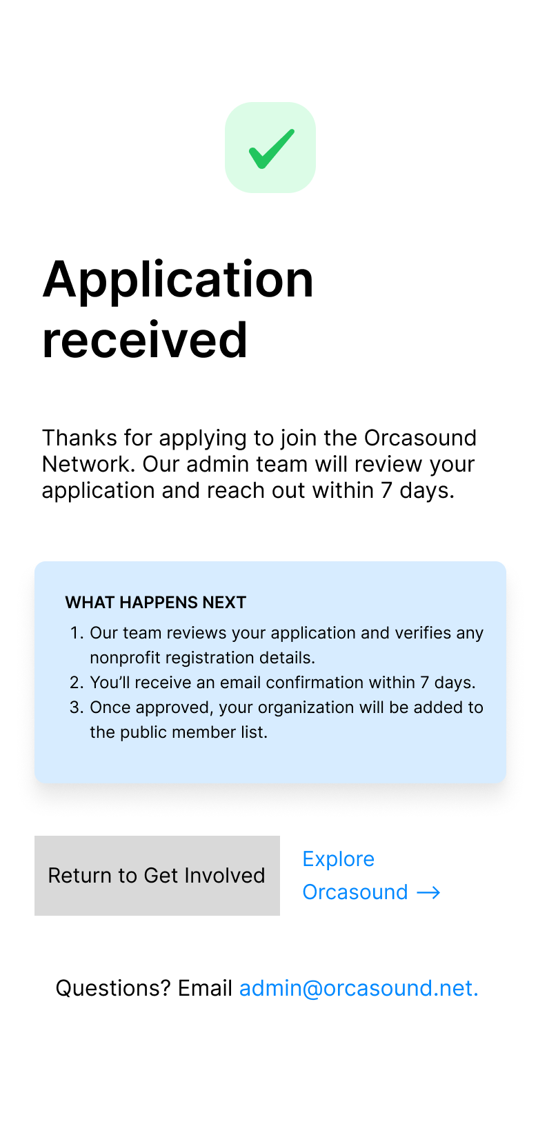
There are 74 Southern Resident Killer Whales left. This is the membership experience for the international network working to keep that number from going lower.
Orcasound needed a way for prospective members to read the network's membership terms, see who'd already joined, and apply — without a login, and without burying the agreement in a Google Doc link.
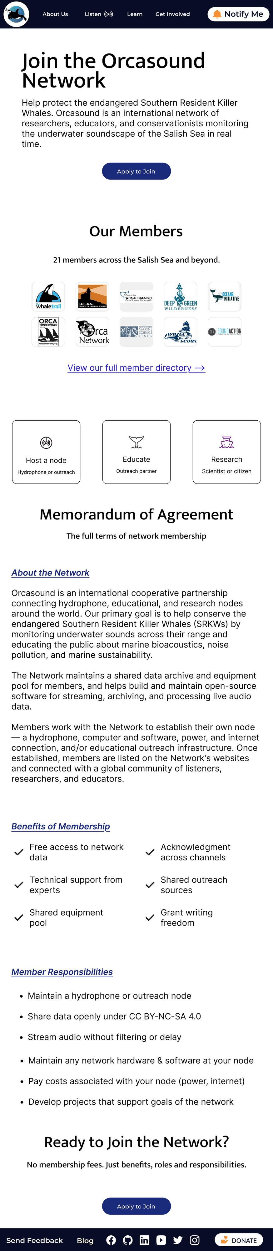
A responsive Get Involved page with the full Memorandum of Agreement embedded inline, a public member directory, and a conditional application form — handed off with developer-ready, MUI-compatible annotations.
Real briefs shift. Building at mid-fidelity first, confirming scope changes in writing, and asking before guessing saved real rework time across three weeks of stakeholder feedback.
Orcasound is a cooperative network of hydrophone, research, and education nodes monitoring the underwater soundscape of the Salish Sea — work that directly supports the Southern Resident Killer Whales (SRKWs), one of the most closely studied and most endangered marine mammal populations on the West Coast. Brendan, the project's PM, brought me in to redesign the network's Get Involved experience: the page where prospective members learn what the network does and apply to join.
The brief had teeth. Port a Google Doc's worth of membership terms onto the live site. Build a no-login application form that doubles as a legal agreement. Satisfy six specific acceptance criteria — including letting visitors read the full Memorandum of Agreement without leaving the page, see who's already a member, and submit an application that counts as their signature.
I came into product design by way of a B.S. in marine biology and a decade spent acting and teaching afterward — not the typical path, but one that turned out to matter more than I expected on this particular brief. The scientific method spends most of its time inside ambiguity: forming a hypothesis from incomplete information, testing it, revising when the data disagrees with you. That's most of what good UX work actually is, and it's a closer match to how I think than anything I picked up in a decade of acting or teaching. Orcasound, with a brief that kept shifting and a stakeholder I had to interpret as much as satisfy, was the first project where that match actually showed up.
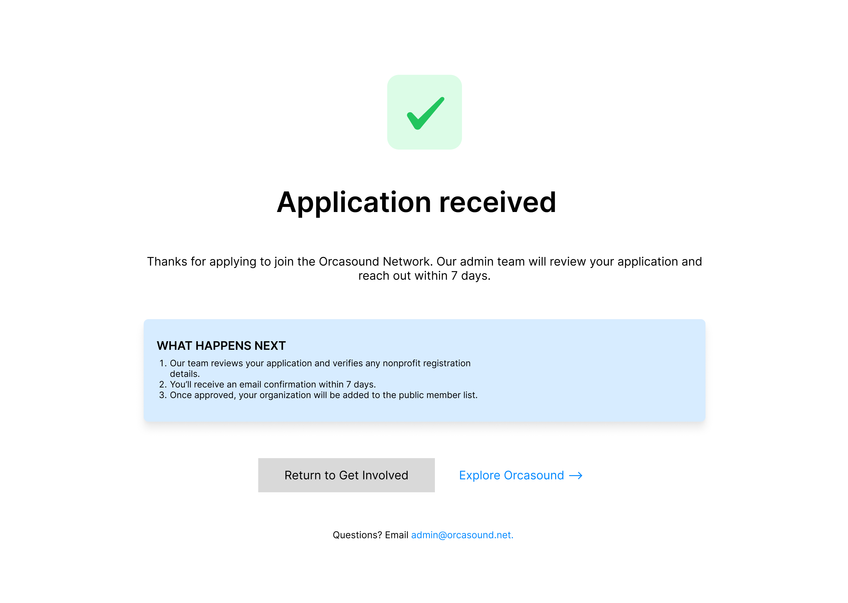
"The review and approval step is a backend process I'm scoping separately, so it's not part of your design work."— Brendan, Orcasound PM
The admin review-and-approval interface had been a quarter of the original brief. Then it was cut, mid-project, in one message. My job wasn't to mourn the lost screens — it was to confirm the new boundary in writing and immediately replan the remaining work around what was actually being asked, not what had been asked three weeks earlier.
That sounds small written down. In practice, it's the difference between a designer who reacts to feedback and one who just keeps building the original plan because it's already half-finished.
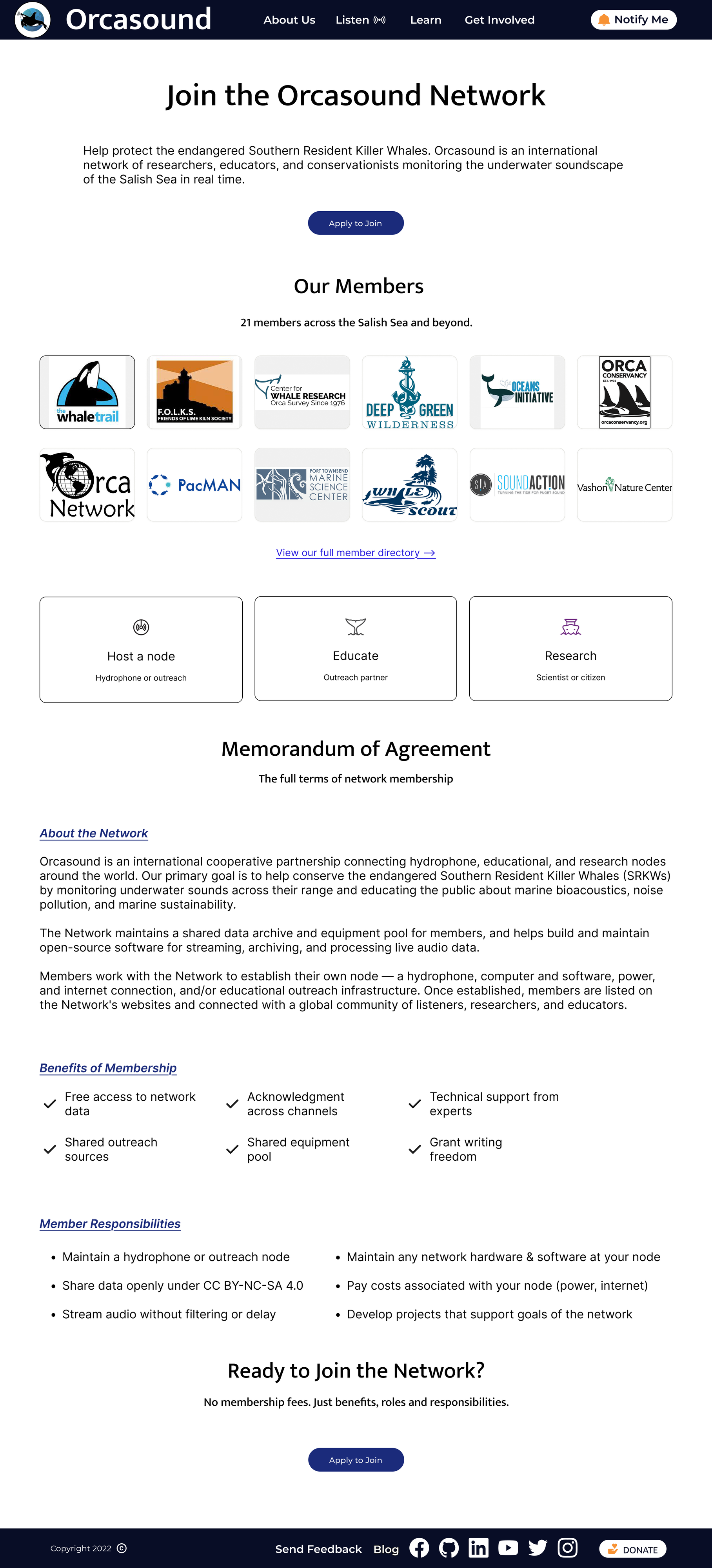
One acceptance criterion required visitors to read the full Memorandum of Agreement without leaving the page. My first instinct was a familiar pattern: an expandable accordion, collapsed by default, with an accessible disclosure pattern and an expand-all control.
Brendan came back with something more direct — he didn't want the agreement tucked behind interaction at all. He wanted it just there. Readable, scannable, no click required. So I rebuilt the section as three plain-language parts — About the Network, Benefits of Membership, Member Responsibilities — set in a constrained reading column so paragraphs don't sprawl edge-to-edge on a 1440px screen, with the full terms intact underneath simplified, scannable copy.
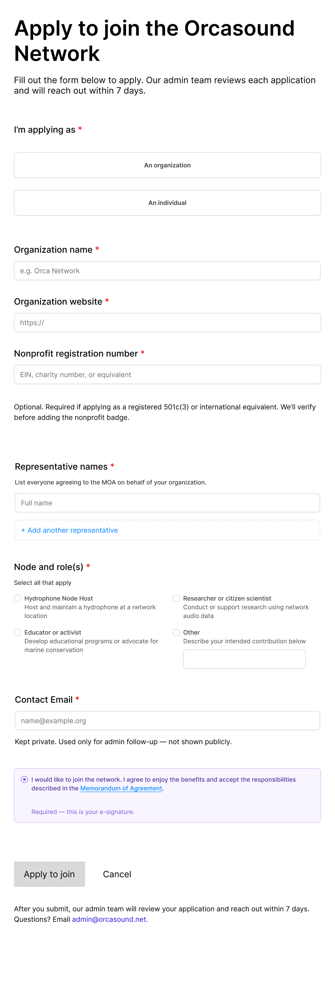
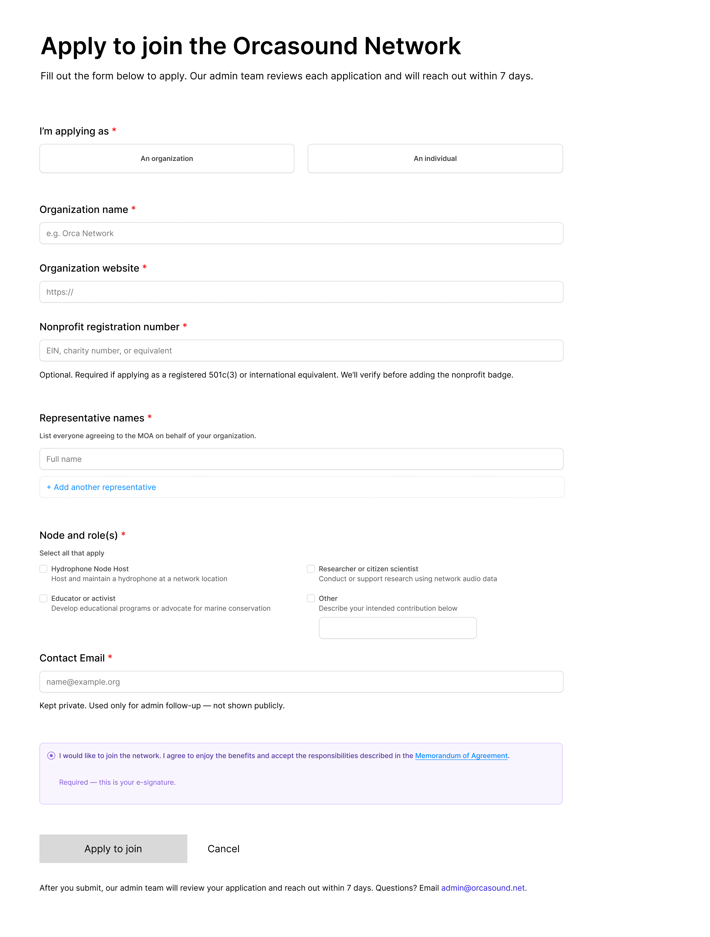
The application form had to work for both organizations and individuals, support multiple representatives signing the same agreement, and let people declare a role using a UI pattern that didn't lie about how it worked.
I caught — and fixed — a real mistake of my own here. The role-selection options looked correct but were built with radio-button components, meaning the form visually permitted only one selection while the copy said "select all that apply." Brendan flagged the mismatch in review. I rebuilt it with true multi-select checkboxes, added an "Other" option with a freeform text field, and gave every option a one-line description so a first-time applicant would know what they were committing to before clicking anything.
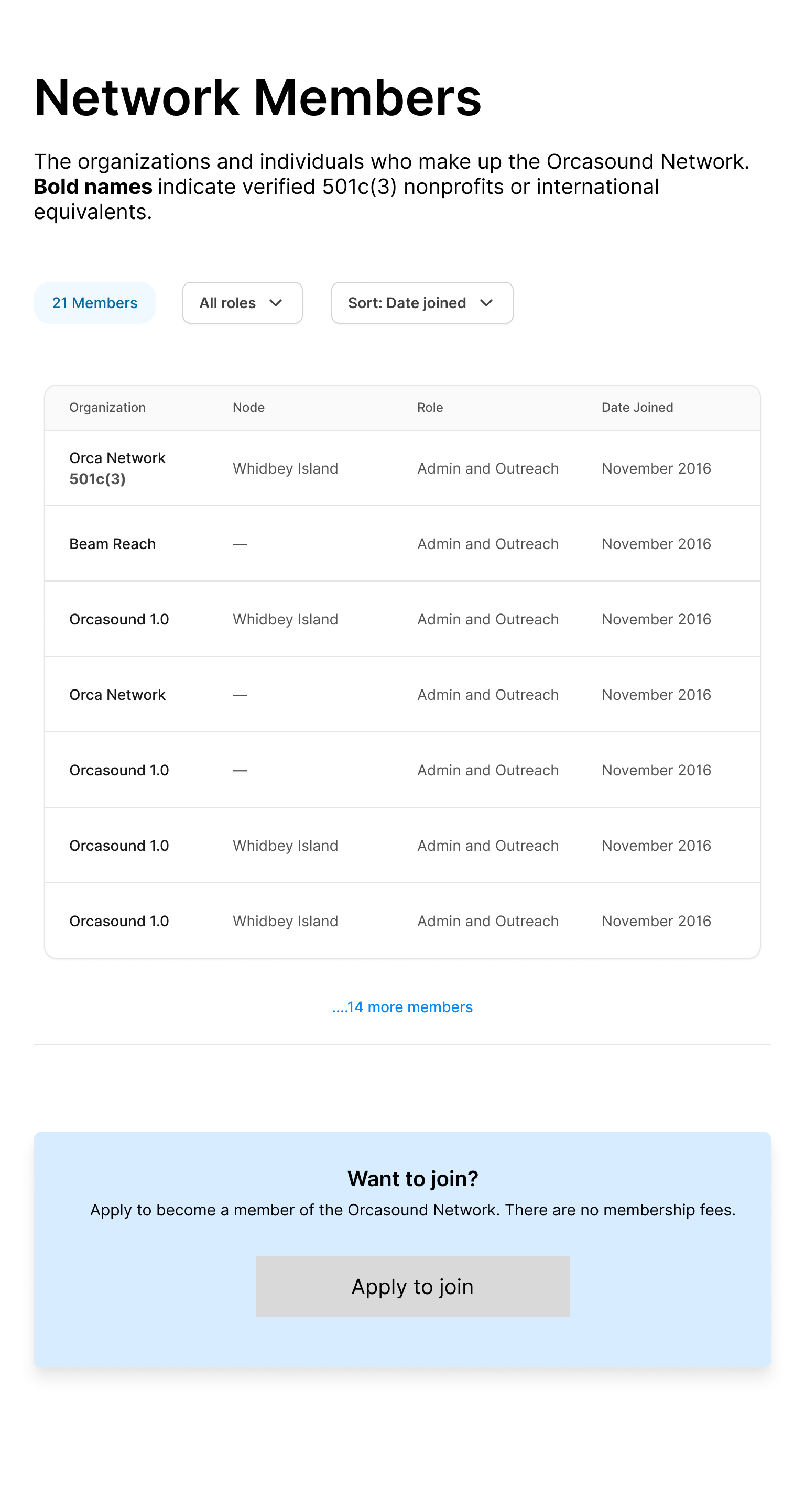
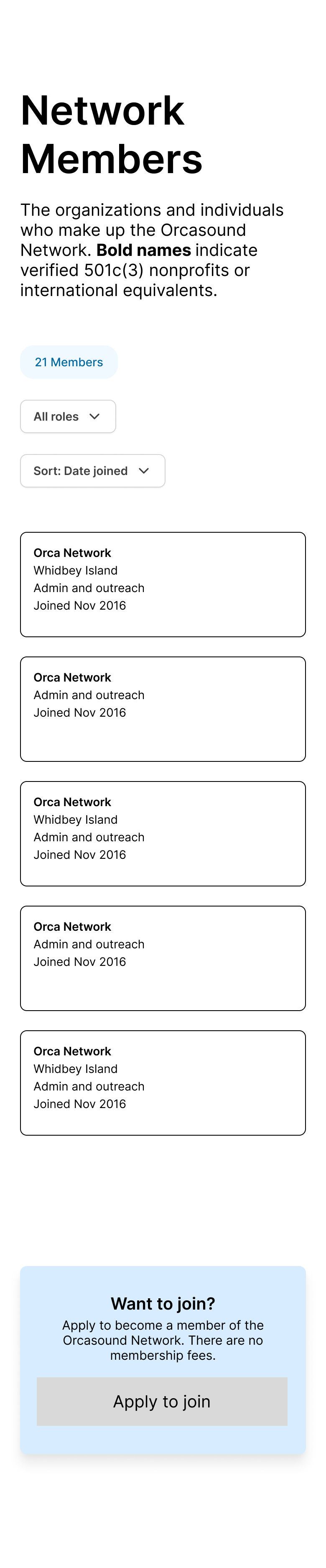
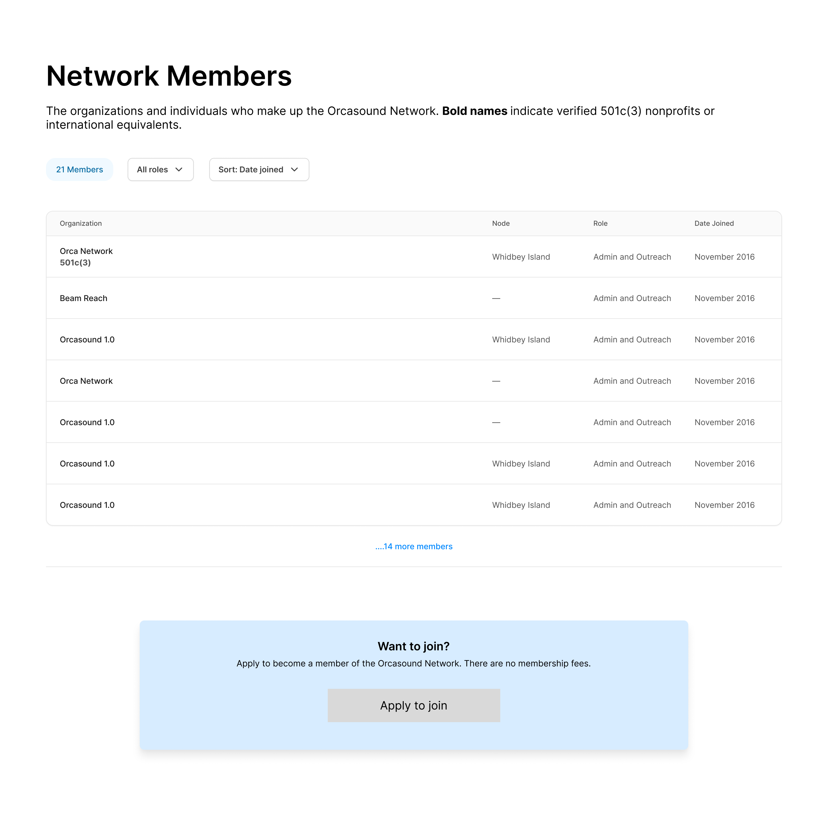
Some of Orcasound's 21 members run physical hydrophone nodes. Others contribute through research, education, or outreach with no hardware at all. An early version of the member directory treated "Node" as if every member had one, which meant roughly a quarter of the table read like missing data.
The fix: a simple dash instead of "N/A" in the table view, the node line removed entirely — not blanked — on mobile cards for members without one, and a single explanatory line instead of a caveat repeated twenty-one times.
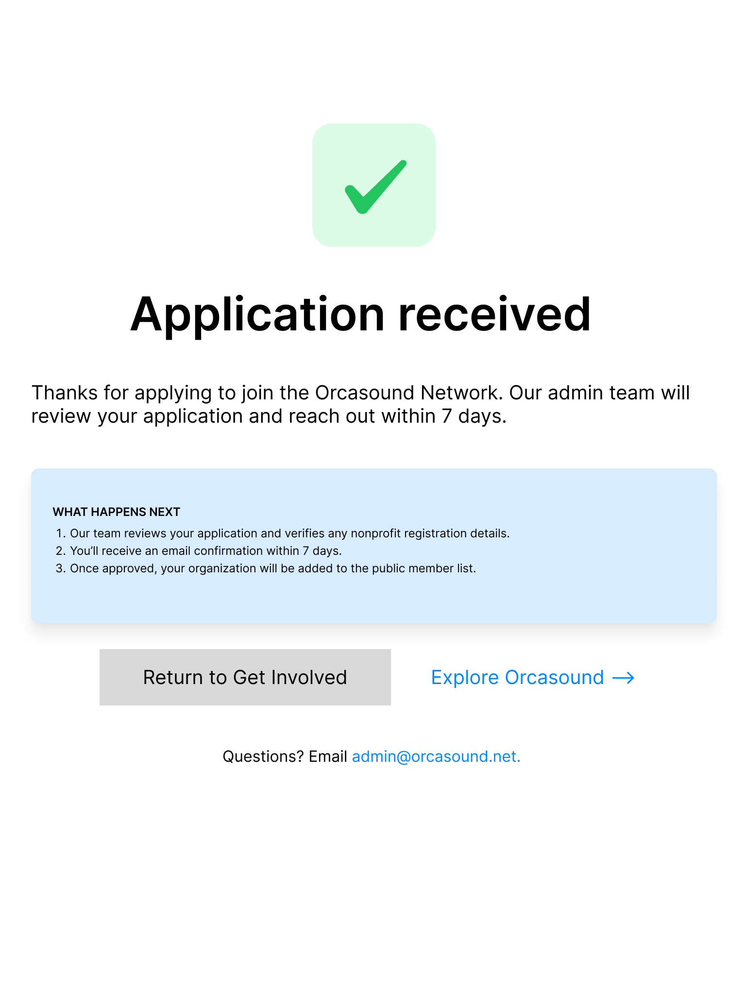
Mobile (390px), tablet (768px), and desktop (1440px) served as anchor breakpoints, with landscape orientations inheriting behavior from whichever anchor they sit closest to in width, rather than being separately hand-composed.
The one exception: the application form got its own mobile-landscape validation frame, because forms are where shrinking vertical space actually breaks things — submit buttons sliding out of reach, agreement checkboxes getting covered by a keyboard. Validating it, rather than assuming it would hold up, was the entire point.
Validated, not pictured here — the proportions held up fine in review, they just didn't earn a place in this case study.
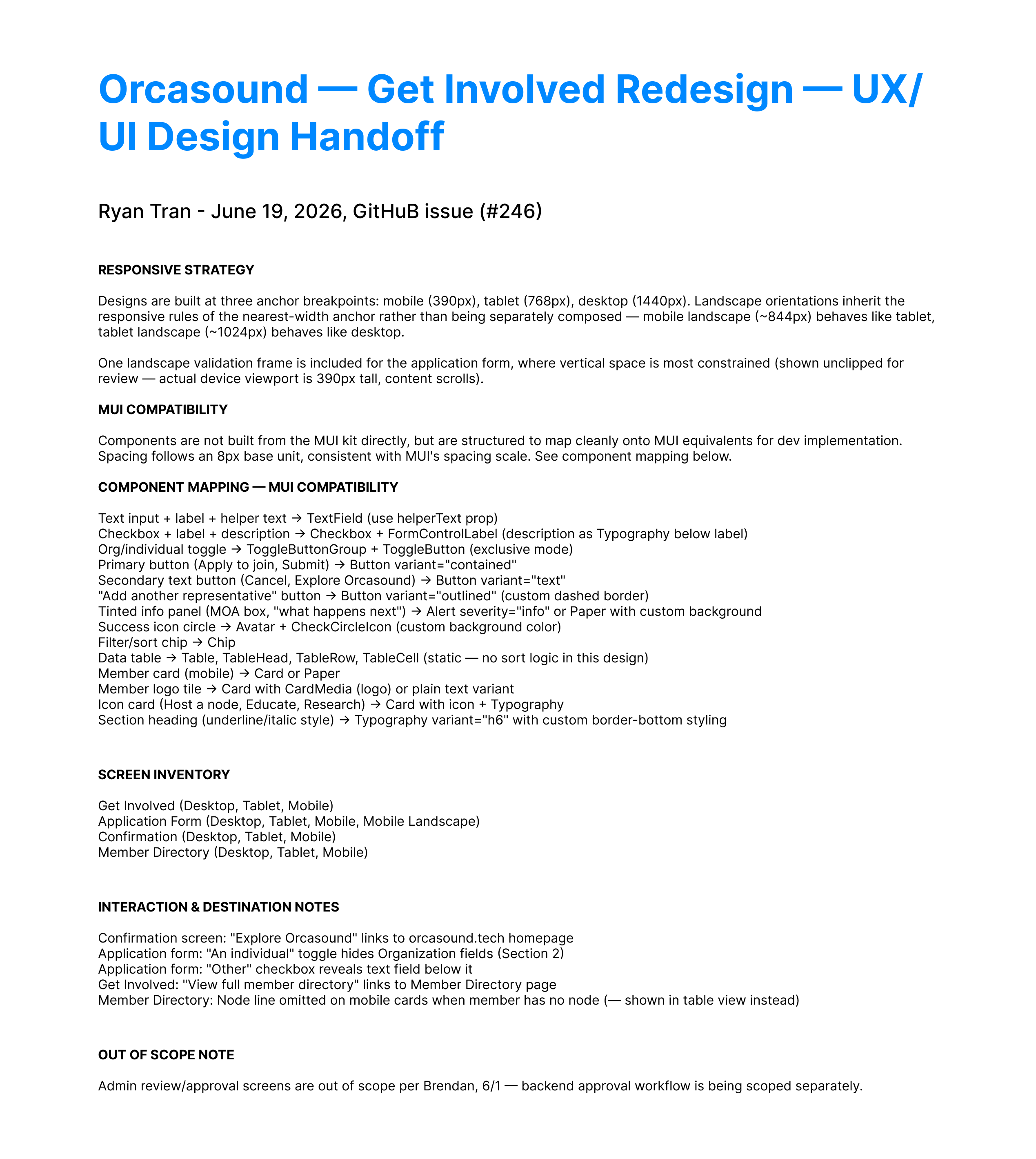
Across several review rounds, Brendan's feedback ranged from quick copy fixes to one note — "integrate MUI" — that could have meant two completely different amounts of work depending on what he actually meant.
Rather than guess and potentially rebuild every component from a kit I'd never touch again, I asked directly: did he want the Figma file rebuilt using the MUI component library, or just structured so developers could map it to MUI components easily during implementation?
"Yes, you have it right... Annotating spacing, typography, and component mappings in your handoff notes is exactly what I want, no need to swap components."— Brendan, in response
It was a file a developer who'd never spoken to me could pick up and build correctly.
I built most of this at mid-fidelity on purpose. With the brief changing as much as it did — the agreement section alone went from "accordion" to "full text inline" — full visual polish early would have meant re-polishing every time the scope moved. Mid-fidelity let me make structural decisions fast and cheap, and save real polish for screens that were actually final.
It's also, not coincidentally, the project I've cared most about getting right. Marine conservation was where I started before acting and teaching took me elsewhere for a decade — getting to bring design back to it, on behalf of a population with 74 individuals left, made the usual stakes of a portfolio project feel a little different.


A Squarespace redesign and UX audit for a Vietnamese restaurant, built from a full case study deck of mockups and content.
Case StudyA UX audit and Squarespace rebuild for a cross-border payments fintech startup, working directly with the founder.
Case StudyA redesign concept for the casting platform, informed by a decade spent on the other side of it.